LOGO & BRANDING
Liberty Church
Liberty Church is a new church plant in a close-knit, rural Texas community known for its strong sense of tradition, neighborliness, and conservative values. The client wanted a brand identity that felt authentic, timeless, and rooted, avoiding trends or overly modern aesthetics.
While open to incorporating the idea of “liberty,” they were cautious about clichés or overly patriotic imagery and they requested something less rustic or “country” in tone.
Above all, Liberty Church wanted a design that could represent an enduring, multi-generational, and multi-ethnic congregation. With plans for future bilingual (English/Spanish) services, the client emphasized the need for a logo easily recognizable across languages and cultures, with potential for future Spanish-language branding.
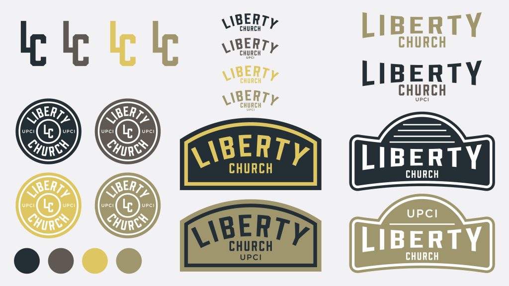
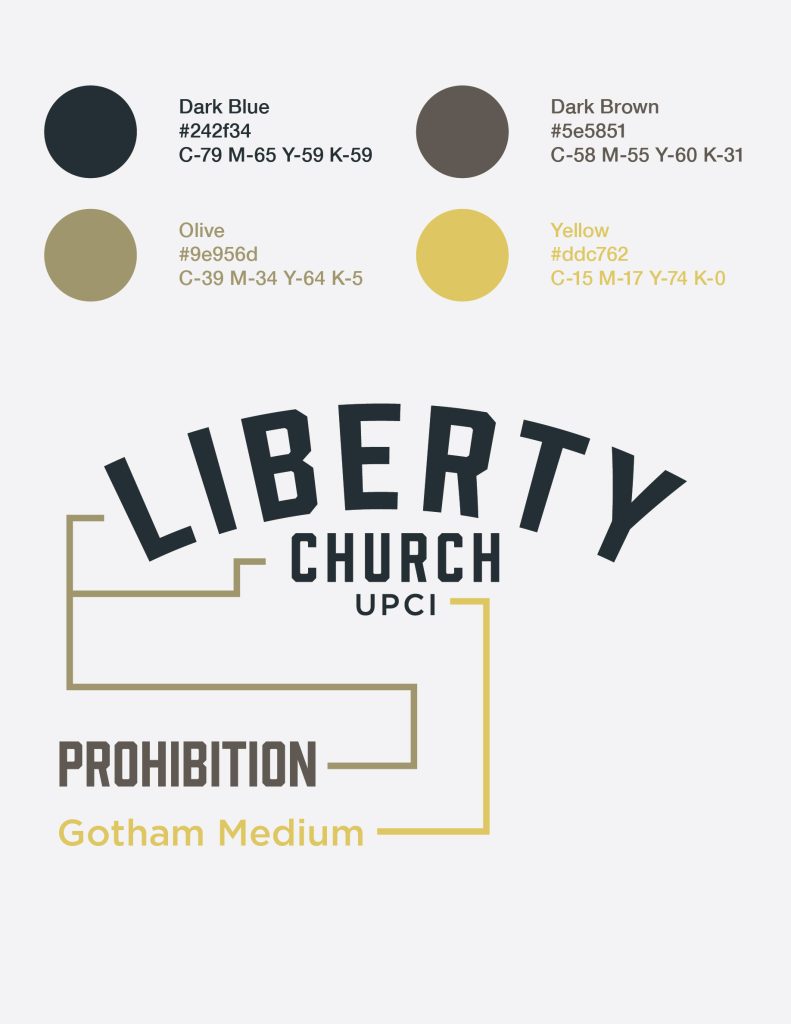
We decided to go with several different logo marks that could be used in a variety of ways.


