LOGO & BRANDING
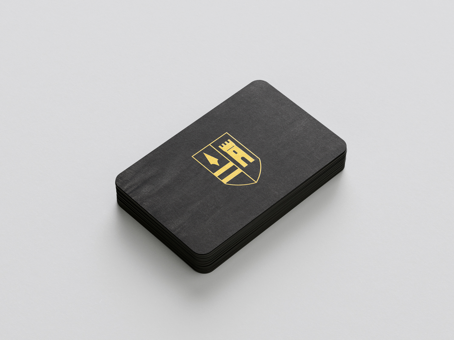
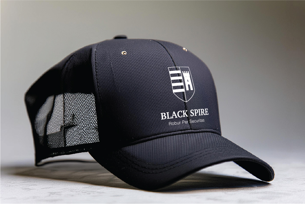
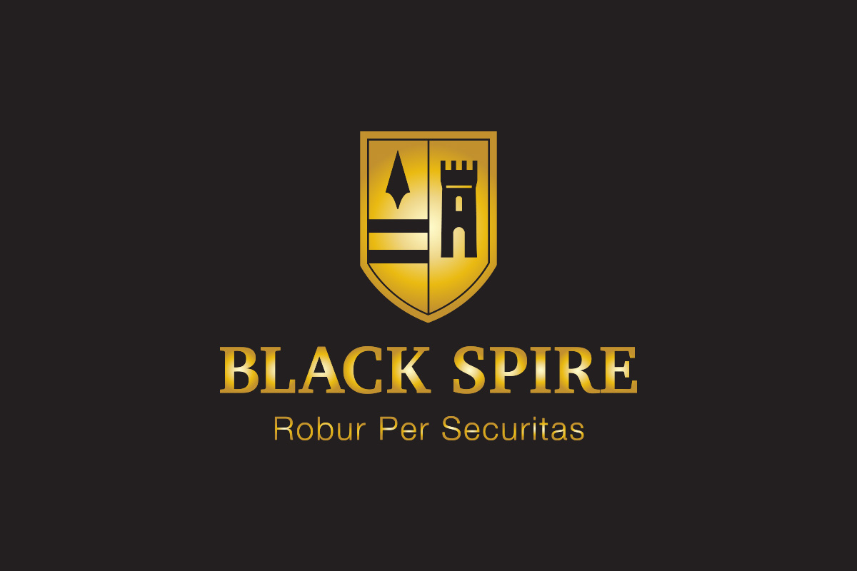
Black Spire is a cybersecurity consulting company. They wanted their logo to look like a crest or shield, symbolizing security and lasting power, rather than the more contemporary style of many cybersecurity firms.
The primary colors are gold and black. The serif font they chose helps to emphasize the corporate image they were aiming for.